NEW! Design Finder Tool
NEW!! 3 products in one!
The acrylic DESIGN FINDER has a light grey grid to use
for finding the perfect design
for your painting.
Whether indoors or out en plein air, hold the grid up
to see what you want to capture in a painting.
Hold it close or further away to change the cropping options.
This is very helpful for getting proportions and angles correct.
Choose one of the four locations where the grid lines overlap for your focal point or most important element.

Use included dry erase marker to capture
your design -only on the ERASABLE FRONT SIDE.
Then hold the Viewer
in front of your canvas
and draw your design on your canvas
looking through your drawing on the Design Finder!
(Use your pencil or paint brush etc.
to draw your design on your canvas.)
Includes a low-odor dry erase marker.
Use for 6x8, 8x10, 9x12, 11x14, 12x16, 18 x 24.
THIRDS MARKER
Included on the design finder
is the Thirds marker!
Easily mark 1/3rd of any size canvas from 4"-18".
(Rule of thirds for strong design)
Simply line up the left side of the Design Finder with the edge of what ever size canvas.
If it is 6” canvas, go the 6” and make a mark.
That is 1/3rd of your 6”. Repeat. EASY.
Then go to other side that may be, say, 8”.
Line up the left side of the Design Finder with the edge of canvas. Find the 8” mark and that is 1/3rd of 8”. Repeat to get all of your 1/3rd marked on your canvas.
Where these lines (marks) intersect, are great locations on your canvas for a focal point! This makes for good design.
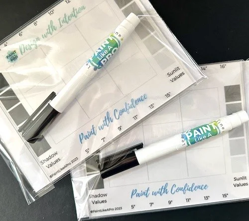
VALUE CHECKER
Along each side helps to see right through the value to easily help you find the light sunlit values on the right
darker shadow values of each color on the left.
Read further down to understand more about value and color.
Design with Intention.
Create with Confidence.
Imagine! Now you can easily get the basic perspective and sizes of trees, houses, streets, buildings and rivers!
Once you have the basic design you can start to paint and refine. Finally get the tricky angles and proportionate sizes you want for a great start on your painting.

Can you see where to sun is?
Which side of the painting?
Using grayscale effectively in painting is all about mastering light and shadow to create depth, contrast, and a sense of volume. Here are a few examples of how grayscale can be used to enhance paintings:

Atmospheric Perspective gives depth and is achieved with value control.
Darkest darks in foreground with less contrast and cooler colors as you recede.
Let’s Discuss Value and Color
Value Scale Transition: A simple gradient from black to white can be used to understand the range of tones available in a grayscale. This helps in determining the lightness or darkness of a color when painting, which is crucial for depicting light and shadow accurately.
All COLORS have a VALUE. It depends on if it is in sunlight or in shadow
On the Design Finder, all the shadow values are on the left and the sunlit values are on the right.
Lit side and Core Shadows: Demonstrating how light falls on an object and how shadows are formed can be effectively shown using a sphere or a cube.
The side facing the light source will have the lightest tone, and as the surface curves away from the light, it transitions into darker tones (shadow), culminating in the darkest area opposite to the light source .
Reflected Light and Cast Shadows: In a more complex composition, such as a still life or a landscape, using grayscale can help show how light bounces off surfaces and creates subtle reflections. These reflections can slightly lighten areas of core shadow, adding complexity and realism.
Cast shadows, on the other hand, can be shown as darker tones extending from objects, helping to anchor them onto surfaces. Cast shadows start darker and lighten up slightly as they go out from the object. The cast shadoe edges also get softer as the shadow gets further from the subject.
Atmospheric Perspective: In landscape painting, grayscale is utilized to depict atmospheric perspective—distant objects appear lighter and less defined than those close up due to the scattering of light by the atmosphere. This gradual change to lighter value and less contrast will create depth in the painting. Generally all the colors get cooler and less intense as they recede.
These examples illustrate the foundational role of grayscale in developing the tonal composition of a painting, guiding the viewer’s eye through the artwork and creating a realistic or intended atmosphere.